Eighth Altenew Class Submission: Irresistible Inking Techniques

Awesome! That’s the single perfect word for this class. Inking techniques that allow you to stretch the use of your inks and develop matching layers of paper for each card. Hats off to Sara Naumann for teaching these techniques! I thoroughly enjoyed it and learned a lot.

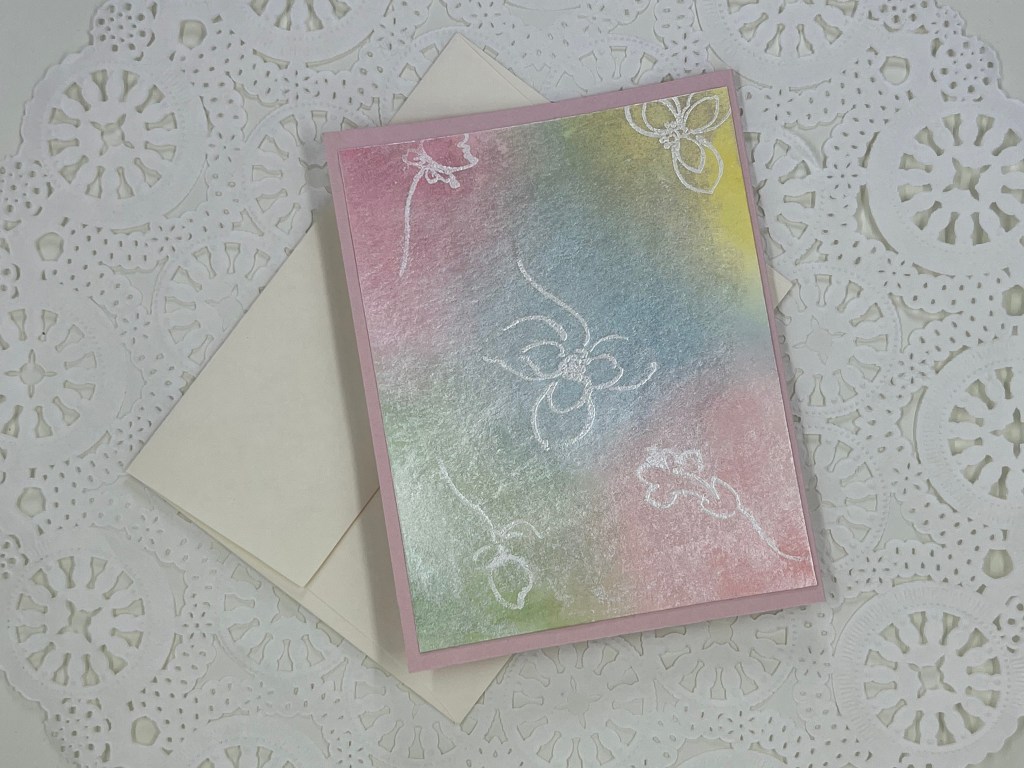
After choosing one single stamp from the Altenew Gardenia Duo stamp set, I decided to heat emboss the image onto HQ watercolor paper (300 gsm) using Princess Gold embossing powder by Ranger. Using the image cut-out from the stencil set, I masked the flower and added leaves as if they were peaking out from behind the flower.

Next I placed smudges of Altenew mixed media ink’s in Frosty Pink, Frayed Leaf, Coral Berry and Evergreen on my glass craft mat along with a small water cup. Using Frosty Pink, I highlighted most areas on the gardenia petals leaving some white areas for contrast. Following with Frayed Leaf on the leaves, I then added darker colors of Coral Berry on the inside of the gardenia and small drops of Evergreen at the core of the leaves and along the veins. The flower was finished quickly because there was no waiting for ink to dry. Heat embossing is fast and it helps to keep the ink inside the lines.

While the floral image dried, I cut a slightly larger piece of watercolor paper and began to ink a very small acrylic block with Frosty Pink. After spritzing the block with water, I carefully inked the paper with four lines across the page and then inked the edges of the panel with the Frosty Pink ink pad. I love the fact that my second layer matches my gardenia!

Next I put a generous amount of Frayed Leaf on my glass mat and mixed it with water. Using a brayer (for the first time EVER!), I rolled a third, slightly larger, watercolor page with the mixture. Afterwards, I inked edges of this watercolor paper with the Frayed Leaf ink pad.

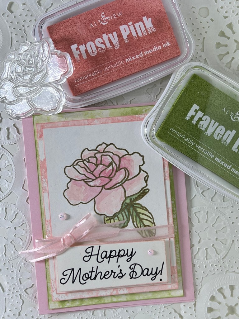
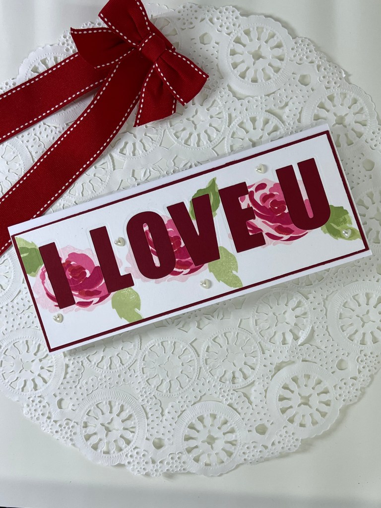
As I began to assemble the card, I realized it would make a wonderful Mother’s Day Card for my soon to be 88 year-old mother! Using Alyssa Stencil Script font and my Cricut, I printed the ‘Happy Mother’s Day!‘ sentiment using black ink on Neena Classic Crest 110 lb cardstock. I then cut a small rectangle around the text, edged it with Frosty Pink, edged the floral focal piece with Frosty Ink and began to build the card.

The sentiment is placed with foam tape at the bottom of the image. Both the image and the sentiment are then glued to the next layer bearing the light stripes of Frosty Pink. Next I wrapped the ribbon around, tied a bow and secured it all onto the green brayered image with foam tape. Lastly, all the pieces were adhered to Bazzill, Cotton Candy cardstock and topped off with three Pearly Pink Baubles from Trinity Stamps. For me, my card is never complete without a corresponding envelope so I used The Stamps of Life envelope liner with hearts to finish my project.

This card was lots of fun to make! I really loved this class and all it had to offer in techniques. Thanks so much for dropping by and please don’t hesitate to comment. Critiques are always welcomed!

Jan

Seventh Altenew Class: For the Guys!

Admittedly, after 36 years of marriage, you’d think I would have some experience making cards for the handsome man in my life! Since I didn’t find paper crafting until well past the dating years, I have to admit this class threw me a little. Leave it to Atlenew to save the day with the first lesson, in the series of six, for this class. It was all about geometrics.

Most of my Altenew inventory, if not all of my Atlenew inventory, is full of floral dies, floral stamps, floral embossing folders and stencils…except one! Thankfully, I had purchased the Altenew Dodec Star Die early on in my introduction to Atlenew so that geometric set became my card inspiration.

The color pallet for this masculine cards is very basic. Starting with a black card base and adding a kraft card stock panel, I built this card using one simple die from the Dodec set cutting several times from black card stock and then white card stock. Seperating all the small pieces, I glued two black outlines to the kraft stock and then one white outline to the kraft stock. Just like a small jigsaw puzzle, I began to glue the inside pieces from each cutting until all three geometric images were complete.

Placing the die cuts into each design is a tedious but very therapeutic process that I grew to enjoy.

Finally, I stamped the “THANK YOU” sentiment from the Altenew “Many Thanks” stamp set. Adding one last white geometric outline to my black envelope liner, the card and envelope are ready to go!

This was my favorite, but not my husband’s, so since this lesson was all about “Guy” cards…I acquiesced and featured his favorite first 🙂

On this card, using two additional dies from the Altenew Dodec Star Die set, I repeated the same process only with much more “therapeutic” paper piecing. If my math is correct, there are 36 seperate white pieces of paper placed into the black outline of the large Dodec die. This really is a fun process once you get all the small pieces corralled on your craft desk.

Using the smaller die, cutting both from black and white, I repeated the same process and alternated between black and white, placing the pieces randomly below the larger image. The “thanks” sentiment featured on this card is also from the Atlenew “Many Thanks” stamp set. It is all but impossible not to find an appropriate Thank You of some type from the “Many Thanks” set. So glad I purchased it! On both cards the stamped sentiment was done with Altenew, Jet Black mixed media ink.

As always, I completed the set with a black envelope liner and randomly placed white geometric figures on the inside.

I hope you’ve enjoyed this post of my “Guy” cards. Honestly, I think this card would be great using any selection of colors and would be equally as masculine. I would love to hear your opinion. Critiques are welcomed. Thanks for stopping by!

Jan

Sixth Altenew Class: Easy Ink Blending Techniques

This class was a lesson in patience, not my forte! Blending inks is fun but not as easy as one might think. First off, you have to blend colors carefully so they don’t become muddy. Choosing the right colors was a challenge. Creatively, knowing when to stop is a personal problem so I had to be careful not to overdo it!

In the end, I wound up with four cards that were blog worthy. There were plenty more left on the craft desk that didn’t make the cut. LOL! Today’s first card is my favorite. I’d love to be a watercolor artist. The class provided some incredible ideas on how to “fake it till you make it.” Blending isn’t just about ombre. You can also ink blend like a watercolor artist.

All of the cards feature Altenew’s Golden Garden stamp set. I love this set because of the simplicity of the flowers. Using HQ watercolor paper, I stamped and embossed one of the flowers to the right of front using Versamark Dazzle embossing medium and Ranger Princess Gold embossing powder. Afterwards, using a blending brush, I added a “blob” of Altenew’s Mixed Media Buttercream ink to the floral part of the image. With a smaller blending blush I added additional “blobs” of Altenew’s Frayed Leaf and Forest Glades to the stem and leaves. I didn’t work too hard to place the ink because the next step was to use a wet paint brush and pull the ink around the image. Using generous amounts of water, I added small amounts of Buttercream to the top of the card and Frayed Leaf to the bottom of the card. So simple! Perfect Pearls gold was used for the splatters. I cut The Stamps of Life, “Peace” sentiment from glossy gold paper, adheared it to the top of the card front and then placed the card front on the same glossy gold cardstock for matting. On the inside, I heat embossed (with the same Ranger Princess Gold) the sentiment “thinking of you & wishing you peace” also from The Stamps of Life. This was literally one of the easiest cards ever!

The word “Peace” is featured on the front and inside. Great for a struggling friend!

The card above was one of the first I made after completing the class. Using HQ watercolor paper, I embossed the same flower from Altenew’s Golden Garden stamp set. I started inking the left of the card front with Altenew’s Arctic blue ink, transitioning next to Caribbean Sea and ending with Persian Blue over the embossed image. I love the way embossed images resist ink! Next I decided to use Perfect Pearls “pearl” (mixed with water) and painted it on the entire front of the card. I wasn’t sure how it would look but I was very happy with the way it seemed to smooth out the hombre. I also splattered this card with Perfect Pearls gold and placed the same Peace sentiment at the bottom of the card front. Lastly, I used three Beach Day gold & blue gemstones from Spellbinders to top off the look. The card front was then placed on the same glossy gold card stock used in the previous card for matting and then placed on a matching Bazzill Blind Date blue cardstock. On the inside I embossed the same “thinking of you and wishing you peace” with Ranger Princess Gold.

Below are two additional cards from my ink blending experiment!

I hope you’ve enjoyed this post. As always, constructive critique is welcomed. Thanks for dropping by!

Jan

Fifth Altenew Class: Easy Die Cutting Techniques

There was lots to learn in this class! The instructor demonstrated the use of dies as stencils, embossing with dies, cutting vellum with dies, inlaid die cutting, embossing with die cuts and the use of negative space from dies. (Does that sentence remind you of Bubba talking about Shrimp in the movie Forest Gump? Sorry…I just had to say it!)

For my cards, I decided to try my hand at heat embossing on vellum die cuts. But first I needed a background for my card. Believe it or not, I have never tried an ink ombre backdrop…so this was a first!

My first Ombre ink!

Using Altenew mixed media ink colors Arctic, Caribbean Sky and Persian Blue (with a blending brush) on Hammermill Premium Color Copy Cover 100 lb cardstock, I started with light colors on the left and worked to the right with darker colors. This is definetly something I’ll do more often because it was fun and easy. Next I cut my “blessed” from Altenew Mega Blessed Die using 110 lb Neenah Classic Crest. I cut two of the same die and glued them together for a little more dimension and strength. After glueing the die cut to the front of my card, I heat embossed the flower and leaved stems from Altenew Doodle Blooms. My vellum choice is from The Paper Company and it’s called Translucent. It has a beautiful pearlized sheen to it and is not quite as translucent as typical vellum. The emobossing powder is Princess Gold by Ranger. I mounted the card front on gray cardstock. If the leaves look like they are popping up, its because they are. By design, I wanted a little bit of deminsion so I didn’t glue them completely down. For a finishing touch I added three Trinity Stamp “Buble Blow Out” gems. The inside sentiment, “BLESSED TO HAVE YOU IN OUR LIVES,” was stamped in Altenew Jet Black and is from the Many Thanks sentiments by Altenew. I just got the sentiment set and I love it!

Adding an envelope liner to match the card exterior is a must! I also embellished the inside of the envelope with a couple of heat embossed vellum flowers just for fun.

My next card design was all about the negative and the All About Us Altenew stamp set! Using my Altenew Inks Frosty Pink, Coral Berry, and Ruby Red, I stamped the rose from All about Us across a slim line card front in a repeating pattern. The leaves were stamped from the same set using Frayed Leaf and Forest Glades. Next, I used my Altenew Caps Bold Alphabet Die to cut out the words I LOVE U! To make the wording stand out more, I adhered the card front to a dark red card stock and placed both on a slim line card cut from Neenah Classic Crest 100 lb. The finishing touch here was Park Lane pearl hearts.

The final addition was the sentiment “you make my heart happy” once again, from the very versital set “All about Us” stamped in Altenew Jet Black ink.

Another positive to a “negative” die card is the fact that I now have large “I LOVE U” lettering cut from beautiful rose print cardstock. Ready for another new card!

Hope you’ve enjoyed this post. As always, constructive critique is always welcomed!

Thanks for dropping by!

Jan

Fourth Altenew Class Submission:Clean & Simple Boutique Cards

This was one of my all-time favorite classes! Simple often equates to elegant and learning to STOP is important. It’s easy to keep adding to a card when you have enamel dots on your desk and glitter in the next drawer. Stopping is not my forte and this class helped me appreciate clean and simple.

My first card was inspired by simple repetition and just a hint of color.

Using a simple flower from Altenew’s Doodle Blooms stamp set and Jet Black mixed media ink, I first stamped the image three times on the left and five times on the right of a white panel cardstock cut from Neenah Solor White 110 lb. Because I wanted to add color to the flowers, I heat set the black ink. Next, I used my Score-pal to emboss two narrowly spaced parallel lines between the two sets of flowers. (Hard to see in the photo.). This embossing tip was demostrated in the class and I think it’s a simple and brilliant way to add interest to a card. Next I used Altenew Frayed Leaf and Buttercream Inks, mixed with just a tad of water, to color the flowers. Finally, I added the small Thank You sentiment from Altenew’s Painted Butterflies stamp set. I mounted the panel onto yellow Bazzill cardstock and then onto an A2 card cut from black cardstock.

My second card was similar in style using a larger floral image and leaves from Altenew’s Doodle Blooms stamp set.

Carefully aligning the stem of the leaves with the curve of the flower petals, I positioned the same leaf stamp on each side of the flower. On this card I used the sentiment, “I’m always here for YOU” from Altenew’s Painted Rose stamp set…. making this card all about the person who receives it! As before, I mounted the white panel on yellow and then onto black cardstock. In each of these cards, I placed a white panel on the inside for a personal note to the recipient.

This technique is perfect when you need a quick card for that special occasion. Over embellishing is a real challenge for me so being “forced” to create a simple card was exactly what I needed. Thanks so much for visiting my blog and joining me in the journey for Altenew Certification. As always, constuctive critiques are very much welcomed!

Have a great day and hope you’ll visit again soon!

Jan

Time for Tombow!

Many months ago, I began collecting Tombow’s Dual Brush Pen Art Markers. Available at Michaels, JoAnn’s and numerous other craft stores, my stash has grown but is not yet complete. I became a “marker” fan after attending one of the Stamp & Scrapbook Expo’s where I discovered Art Impressions (AI) stamps. I took an AI class and got hooked on the art! In this post, I’ve included one AI stamp but then decided to branch out and try other card designs. So glad I did! It was fun!

This card features the Large Watering Can and several different vines, grasses and flowers from multiple Art Impressions collections.

The AI image was stamped on Canson Watercolor paper. The deckled edge for the watercolor paper was achieved by taking a large sheet, making numerous folded edges, wetting the edges with water and then tearing the edges before they dry. I placed the small rectangular pieces of wet edged watercolor paper on a cookie rack and allow them to dry.

The striped backing is core-dinations’ Light Pink Stripe purchased at JoAnn’s. I used the same cardstock to make an envelope liner from The Stamps of Life die. Finally, I placed it all on purple cardstock and added the gold sentiment, Sending Smiles, also from The Stamps of Life.

I used multiple Tombow Dual Brush markers for this image. Because I’m not a trained artist, I recently invested in The Color Catalog and The Color Catalog Companion by Sarah Renae Clark. It’s an incredibly valuable tool for anyone needing a resource for color combinations and coordination. Sarah has a complete listing of Tombow colors (as well as other manufacuteres of color products) and provides an easy to follow format on how to pair those colors for maximum effect. I highly recommend it!

My Favorite Things, Snow Drifts Cover-up Die, was a simple and elegeant base for this card.

After cutting the Snow Drift base die from Neenah Classic Crest 110 lb cardstock, each wave section was colored in four alternating colors with Tombow Markers #947, #991, #847 and #177. Next, I glued the base outline of the Snow Drifts die onto an A2 size card front (also cut from Neenah Classic Crest) and adhered the colored waves back into the die cut with Tombow adhesive. The leaves, from Spellbinders Autumn Leaves, were also die cut (same Neenah cardstock) and colored with Tombow #991, low lighted with Tombow #947, blended with Tombow #NOO colorfast blender and adheared to the card front. Finally, the “thanks” sentiment die from The Stamps of Life was cut from gold cardstock and added to the front. The same gold cardstock was used for the envelope liner, also from The Stamps of Life.

This simple and easy card was made from three stamps in the Altenew Golden Garden stamp collection.

This A2 card was stamped with three floral images from the Altenew Golden Garden stamp set and embossed with Princes Gold embossing powder by Ranger. The flowers were lightly highlighted with Tombow Dual Brush Pen Art markers #772, #451 and #850 and blended using #NOO. Blending the Tombow #772 with water, I placed a series of light splatters over the front of the entire card. The Cherish the moments sentiment and shadow by Tonic-studios, was cut from gold cardstock and placed at the bottom. The envelope liner cut from pink cardstock, is The Stamps of Life.

Bright, happy and easy little A2 card!

Tombow Dual Brush Pen Art Markers #623, #173, #723, #055 and #133 were used for each heart (cut from watercolor paper) using Memory Box Double Stitched Hearts dies. Each letter of the Smile sentiment die, from The Stamps of Life, was also colored in the same markers. Mixed with water, I used Tombow #723 and splattered the front of the card card, masking the hearts. Not finding an appropriate colored cardstock for the envelope liner, I came up with a simple solution of coordinating watercolor stripes painted on watercolor paper stock and cut from The Stamps of Life envelope liner. The final addition was coordinating enamel dots also by The Stamps of Life.

Something bright as we head into the winder months!

This card was so much fun! I had recently purchased a selection of bird dies from Papertrey Ink. At the beginning, I had no idea what kind of card I wanted to make and the final product was a hodgepodge of dies from different manufacturers. The base die, Watercolor is one of my favorite from Altenew. After cutting the Watercolor die from Neenah Classic Crest, I colored it in Tombow #723 mixed with water. Next I cut the bird, Papertrey Ink Feathered Friends #9, from the same card stock and used the following colors for the various wings, crown, body, feet and beak: Tombow #055, #933, #026, #947 #837. The two tropical leaves, cut from Elizabeth Craft Designs Tropic Florals, were colored in Tombow #173, low lighted on the edges with Tombow #195 and blended using the Tombow #NOO colorfast blender. Finally, I mixed Tombow N15 (Black) with water and color splattered the base prior to assembling the images on the front. Searching through my sentiments by The Stamps of Life, I found the Brigher Days, cut it from glossy black cardstock purchased at Michaels and placed it to the top right. The card size is also A2.

Thanks so much for visiting my blog. Hope you’ve enjoyed my “Time for Tombow” cards. As always, constructive critiques are very much appreciated.

Jan

Altenew Academy’s “Celebration Stencil Techniques”

Third Class Assignment for Altenew Education Certification Program

Making the most of your craft stash is so important. The Celebration Stencil Techniques class teaches creative ways to maximize your products using die cuts, made from heavy cardstock, as stencils!

My first project features a stencil made from the Altenew, Watercolor die cut from Accent Opaque White 120 lb. cardstock. After cutting the die, I placed it on top of Neenah Classic Crest cardstock just as I would a stencil. Using a blending blush and Altenew Crisp Dye Ink in Coral Berry, I developed the striped background for my card. Next I stamped the Altenew, grateful for you sentiment from Story of Us collection on the bottom right corner in Altenew Crisp Dye Ink in Jet Black. I then die cut the flower, from Altenew’s Craft a Flower: Cosmos layering die set. The flower was made with three different yellow paper cardstock selections beginning with the base layer in a darker yellow and working my way out to the third layer which was lightest. I cut the center of the flower and the stem and leaves from the same green cardstock and then added a final center to the flower in white.

Arranging the pieces for placement only, I determined that I wanted the stem and at least one leaf to extend beyond the Watercolor stencil so I framed it on black cardstock and mounted it all on a 5 X 7 card made from Neenah Classic Crest. My final addition was Bubble Blow Out gems from Trinity Stamps.

The Watercolor die is one of my favorites. I’ve cut it from kraft cardstock, black cardstock and now used it as a stencil. Love getting that much value from a purchase!

In the interest of frugality, I now had a leftover die that was also covered in ink. So, learning from the class, I used it to make a second card!

There are two flowers in the Craft-A-Flower: Cosmos layering die set and the difference in each flower really stood out to me as I cut the second one from three layers of purple cardstock. This time, I used the lightest color for the base and built darker as I moved outward in the flower development. Wanting contrast for the card image, I placed the die on black cardstock and began to place the flower image, stem and leaves over the die. On this card, I used a lighter green cardstock for the stem and leaves.

As a single flower, it almost looks like the wind is blowing it to the left and I just loved that image. Because I like a little bling, I decided to place gold over yellow for the center of the flower and heat embossed the lots of love sentiment (again from the Story of Us collection) on the bottom left corner using Princess Gold embossing powder by Ranger. Finally, for a little added whimsy I decided to use the Atlenew, Creative Edges: Scalloped Scallops Die Set for the flowing dots at the top and bottom of the card.

A closer look at the sentiment in bling!

Thanks for joining me once again on my journey toward certification in the Atlenew Program. As always, comments and critiques are appreciated!

Jan

Second submission for the Altenew Education Certification Program

Altenew’s Class “All About Layering 2” was packed with new layering ideas for card making. Clearly, my favorite design inspiration featured the layered letters!

Using the Story of Us, the same Altenew stamp and die set featured in my first submission, I stamped and cut the rose and leaves using Altenew inks Frosty Pink, Coral Berry and Ruby Red for the rose and Frayed Leaf and Forest Glades for the leaves. Next I die cut the word “LOVE” and the letter “U” using Altenew Caps Bold Alphabet Die. I cut the stem of leaves from the Craft-A-Flower:Cosmos Layering Die Set using Darice, Napa Valley green cardstock. Finally, using kraft stock, I cut the burlap background layer from the Atlenew Burlap Texture Die. I also used the same kraft stock for the envelope liner.

The letters L,O & V were cut from one flower and letter placement was designed to feature most of one full rose. The letters “V & E” feature one full leaf. The pink background cardstock is Bubble Gum by Darice. The white enamel dots are from The Stamps of Life, as is the inside matching kraft cardstock envelope liner. The card base is Neenah Classic Crest 100 lb. To make the Bold Alphabet letters stronger and more “snail male” friendly, I cut three layers from the Neenah cardstock and glued them to the back of each letter. I find this technique to be more durable than foam tape. It takes a little more time but the final results are worth the effort!

For an inside sentiment, I heat embossed XOXO, also from Story of Us, in Magenta Embossing Powder by Ranger. As I mentioned in my first submission, I love the sentiments from the Story of Us stamp set. The XOXO is just perfect for this A2 card!

Featuring the same dies and inks above, I tried the process again on Neenah Classic Crest without the Darice, Pink Bubble Gum backer. The pink enamel dots are from Eyelet Outlet.

Not sure which is my favorite? Doesn’t really matter….the love of paper crafting is as much about the process as it is about the final result!

Thanks for stopping by and taking a look at my blog. Hopefully you’ll visit again for my next (and third) submission to the Altenew Education Certification Program. As always, critiques are appreciated 🙂

Have a great day!

Jan

First Submission for the Altenew Education Certification Program

Altenew appeared on my radar this past spring/2021. Layering for both stamps and dies was new to me and I am quickly growing to love the concept. The Story of Us stamp set was one of the first I purchased from Altenew. The layered rose is absolutely georgous and the sentiments are among my favorites. The varying font styles and wording are fresh and contemporary.

My starting point for the 5 x 7 card was a repeating rose pattern across the front using Altenew inks: Frosty Pink, Coral Berry and Ruby Red. The leaves were inked in Frayed Leaf and Forest Glades. After stamping the sentiment (Altenew, Jet Black) I cut it with a stitched die (to add warmth) and then placed it across the top of the card with foam tape. I added the heart jewels from Park Lane adhesive pearls and then framed the card with a coordinating deep red card stock by Bazzill. For a little added “umph” I stamped the sentiment “together you + me” on the inside. This sentiment is a great example of the contemporary characteristics of the sentiments in this set. I just love the “plus” sign ! The white card stock is Neenah Classic Crest 110 lb.

The “you + me” is just precious!
I love the way stitched dies add warmth to a card.

My second card was made with the Altenew Painted Rose stamp and die collection using the same inks as the card above. I stamped the rose twice on Neenah Classic Crest card stock, added the leaves and then used the coordinating die set to cut another rose and leaves to add on top with foam tape. The leaves in this set have layering options wich gave me an opportunity to experiment with depth of color. I then heat embossed the sentiment “thinking of” on the front of the card and heat embossed the word YOU on the inside. (I held my breath on this one! The wiser option would have been to heat emboss on another piece of paper and foam tape it to the front but I didn’t want two raised images.). The embossing powder is Recollections pearl embossing powder in Champagne. Finally, I added three gold dots from American Crafts “Pebbles” and mounted the card on reflective gold card stock from Spellbinders and placed it on the Neena Classic Crest base. The A 2 card has a matching envelope liner from Stamps of Life.

Heat embossing adds so much to a card!
Simplicity!

I’m very excited to be a member of Altenew Academy! All About Layering 1 was a great class with tons of tips on layering. I look forward to learning more and to adding more Altenew products to my growing craft stash!

Hope you enjoy the cards! Critiques are appreciated!

Jan

Grand Baby Shower!

Hand made…

Why buy invitations and decorations when you can make them?

All of these items were cut on a Cricut:

  • The rain drops for each balloon
  • The onsies in each centerpiece and the banner bearing the baby’s name
  • The happy little pink and white rosettes on the windows and bulletin boards
  • The bulletin board words, rosettes and art.
  • The onsie baby banner hung from the ceiling

The rain drops were cut on the Cricut and simply glued to fishing line, alternating pink and white, then the line was tied to each balloon. The happy rosettes are made from the same pink and white paper selections and placed on the windows and bulletin boards all around the room. The restaurant was awesome, they let me cover the unsightly large bulletin board menus with lots of fun baby related stuff! The Ball jars were painted in chalk paint and sanded for a more distressed look. To add a little “rustic elegance” we set the tables with wood chargers and used small Aspen wood stands for each of the centerpieces. We felt like the wood accents were necessary because the room had beautiful wood floors.

Wood chargers and blush colored napkins.

Above: One of the three invitations they didn’t choose.

This was my best friend’s first Grandchild so I wanted the shower to be perfect! Before the shower, I made three different selections of invitation samples and let she and her daughter choose the one they liked most. (She cried when she saw the samples!). The one they chose, the baby carriage design, set the theme for the entire shower! The restaurant let me bring in four small cakes that were made by a local baker near my home. I took the invitation to the baker and they designed the cakes perfectly!

The invitations, mailed in vellum envelopes, were individually addressed on the Cricut. The baby gift registration was printed on the heart and inserted in the invitation. (Names have been deleted for privacy.)