
This class was a lesson in patience, not my forte! Blending inks is fun but not as easy as one might think. First off, you have to blend colors carefully so they don’t become muddy. Choosing the right colors was a challenge. Creatively, knowing when to stop is a personal problem so I had to be careful not to overdo it!
In the end, I wound up with four cards that were blog worthy. There were plenty more left on the craft desk that didn’t make the cut. LOL! Today’s first card is my favorite. I’d love to be a watercolor artist. The class provided some incredible ideas on how to “fake it till you make it.” Blending isn’t just about ombre. You can also ink blend like a watercolor artist.

All of the cards feature Altenew’s Golden Garden stamp set. I love this set because of the simplicity of the flowers. Using HQ watercolor paper, I stamped and embossed one of the flowers to the right of front using Versamark Dazzle embossing medium and Ranger Princess Gold embossing powder. Afterwards, using a blending brush, I added a “blob” of Altenew’s Mixed Media Buttercream ink to the floral part of the image. With a smaller blending blush I added additional “blobs” of Altenew’s Frayed Leaf and Forest Glades to the stem and leaves. I didn’t work too hard to place the ink because the next step was to use a wet paint brush and pull the ink around the image. Using generous amounts of water, I added small amounts of Buttercream to the top of the card and Frayed Leaf to the bottom of the card. So simple! Perfect Pearls gold was used for the splatters. I cut The Stamps of Life, “Peace” sentiment from glossy gold paper, adheared it to the top of the card front and then placed the card front on the same glossy gold cardstock for matting. On the inside, I heat embossed (with the same Ranger Princess Gold) the sentiment “thinking of you & wishing you peace” also from The Stamps of Life. This was literally one of the easiest cards ever!

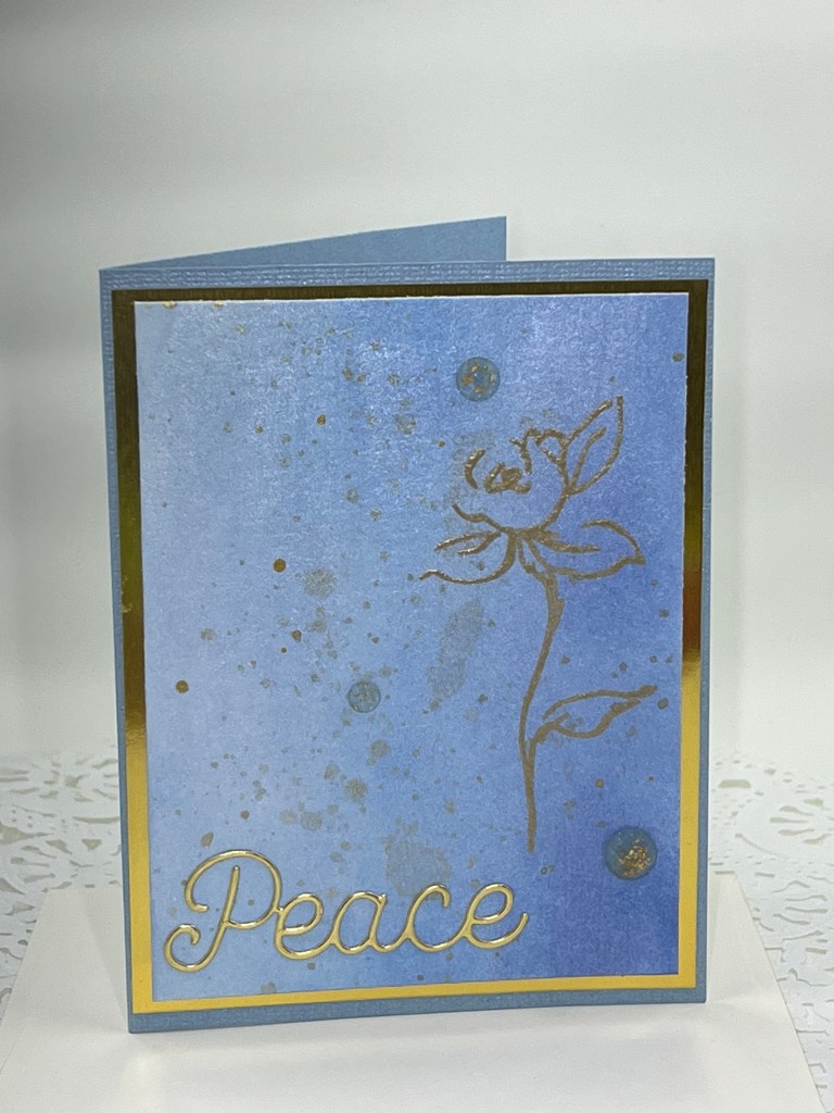
The card above was one of the first I made after completing the class. Using HQ watercolor paper, I embossed the same flower from Altenew’s Golden Garden stamp set. I started inking the left of the card front with Altenew’s Arctic blue ink, transitioning next to Caribbean Sea and ending with Persian Blue over the embossed image. I love the way embossed images resist ink! Next I decided to use Perfect Pearls “pearl” (mixed with water) and painted it on the entire front of the card. I wasn’t sure how it would look but I was very happy with the way it seemed to smooth out the hombre. I also splattered this card with Perfect Pearls gold and placed the same Peace sentiment at the bottom of the card front. Lastly, I used three Beach Day gold & blue gemstones from Spellbinders to top off the look. The card front was then placed on the same glossy gold card stock used in the previous card for matting and then placed on a matching Bazzill Blind Date blue cardstock. On the inside I embossed the same “thinking of you and wishing you peace” with Ranger Princess Gold.
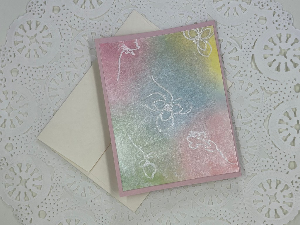
Below are two additional cards from my ink blending experiment!

I hope you’ve enjoyed this post. As always, constructive critique is welcomed. Thanks for dropping by!
Jan

Fabulous artsy cards! Thank you for your submission!
LikeLike
Thanks Erum!
LikeLike
These are just beautiful Jan. My favorite is the blue one, just because I am partial to blues, greens and purples! So simple yet elegant. Definitely good for some one who needs some special thoughts and prayers.
LikeLike
Thanks so much Carol! I very much appreciate the kind comments. Hope you have a blessed week 🙂
LikeLike